Let’s talk about qualitative data today.
It doesn’t get enough love and quantitative always gets more. I want to give you a proper way to analyze qualitative data and then show you examples of how to use it for experiment ideation (since I’m a researcher and an experimenter).
TL;DR
- Qualitative data (the words) usually gets ignored because people do not know how to analyze it. The fix is to turn it into quantitative data (numbers).
- The method is a spreadsheet coding process: responses down one column, themes across the top, mark a 1 for each theme, then count and rank.
- Aim for 200 to 300 responses so the themes are statistically meaningful, then do a second round to boil them down to 3 or 4 big themes.
- A ranked list of themes is your experiment backlog. The top theme is usually your best-supported test idea.
- Then repeat. Research feeds tests, tests raise new questions, and the loop compounds.
What is the difference between quantitative and qualitative data?
We all know there are two types of data: quantitative and qualitative.
Quantitative: “relating to, measuring, or measured by the quantity of something rather than its quality”
Qualitative: “relating to, measuring, or measured by the quality of something rather than its quantity”
The TLDR in my head…
Quantitative = numbers
Qualitative = words
How do people usually analyze qualitative data?
Quantitative is typically easier for people to analyze. Processes for this are fairly consistent across teams. It’s just numbers.
Qualitative is usually the wild west as far as how people analyze it. Many people don’t know what to do with it or how to analyze it properly. They almost never know that you can turn it from qualitative to quantitative either.
You might ask, “Well why would you want to convert it? Wouldn’t you just collect quantitative data in the first place then?” Nope.
Quantitative data usually gives us the “what” of something. Qualitative usually gives us the “why” of something.
The same problem, two lenses:
• Quantitative: "The exit rate on the homepage is 82%."
• Qualitative: "Users don't understand the value proposition or the benefits."
The first one is a fire alarm. The second one is the fire.
Most people’s approaches to analyzing qualitative data: (1) word clouds or (2) reading through responses and taking rough notes.
Neither of those is great. Not very methodical, right?

Word cloud / skim-and-notes
- Counts words, not themes
- Loses sentiment, intent, and context
- Output is a graphic, not a decision
- Can't be re-run, compared, or shared as data
- Feels like analysis, isn't
Spreadsheet coding
- Counts themes you defined
- Preserves the response next to its tags
- Output is a ranked list with totals
- Repeatable: re-code on new data, compare quarters
- Methodical, reliable, defensible
Boom. Here’s where we want to turn it from qualitative to quantitative. It’s much more methodical, reliable, and repeatable.
Process to turn qualitative data into quantitative data
I’ll share with you the process that we also follow at Chirpy. All you have to do is start a spreadsheet. This is where we’ll complete a coding process.
How-to guide
How to code qualitative responses into quantitative themes
A repeatable process that turns 200+ open-ended responses into a ranked list you can act on.
Drop responses into column A, one per row
Aim for 200 to 300 responses. That's the band where you start to hit statistical significance and your themes stop shifting with every new response you add.
Read each response, name a theme
Read response one. Decide what it's about. "Pricing too high." "Confusing checkout." "Missing integration." Write that theme as a header in column B.
Add new themes as columns as you go
Response two might match the existing theme or might surface a new one. New themes become new columns. Don't prune yet. Be generous.
Mark a "1" under every theme that applies
A single response can carry more than one theme. "Pricing is too high and I couldn't figure out the difference between the plans" gets a 1 in pricing AND a 1 in plan-clarity. Don't force responses into a single bucket.
Sum each theme column
Once every response is coded, run SUM on each column. You now have a count per theme.
Sort high to low
Pull the theme list and totals into a fresh tab. Sort descending. The top of that list is what your customers are actually telling you, ranked.
That’s it!
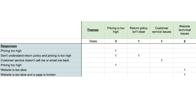
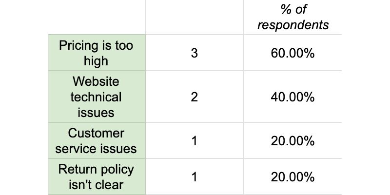
Optional but recommended: You can pull out some of the top quotes along the way, too. That’s always helpful.
If you want to take it a step further, do a second round of coding.
Put the first round of themes in the far left column this time and try to boil them down to no more than 3-4 themes in the top row. (Know that outside of the example above you’ll likely have several more themes to analyze, which would make a second round possible.)





Turn your research into experiments that win
Got a pile of customer feedback and no idea what to test first? Book a 1:1 with a CRO or research mentor on GrowthMentor. One membership, unlimited calls, every mentor included.
What do you do with these kinds of insights?
Now that you have an amazing, prioritized list of customer insights, what do you do with them?
All kinds of things!
Examples:
- Turn them into experiments on websites, mobile apps, or products
- Use them to inform pricing changes
- Use them to inform additional research
- Use them to inform your sales workflows
- Use them to inform your customer service workflows
- Use them to inform marketing campaigns
- Use them to inform your value proposition and creative
- So on and so forth…
Let’s talk about experimentation & how to use these insights for experiment ideation
Because I’m an experimenter, I want to show you how this type of research informs test ideation. I’m constantly telling teams where there is experimentation there should always be research.
"Experiments should not be willy-nilly based on what I think, feel, or want. That all lends to subjectivity. They should be more data-driven than that. And where does the data come from? Research."
Haley Carpenter, founder of Chirpy
Experiments should not be willy-nilly based on “I think,” “I feel,” or “I want,” which all lend to subjectivity and your personal opinions. They should be more data-driven than that. And where does the data come from? Research.
Let’s take the number one theme from the example above: pricing is too high. This is almost always in the results. You must take it with a grain of salt to a certain extent because people always want lower prices and discounts.
However, know that aside from lowering your pricing (which you shouldn’t consider, at least in most cases), we can do other things around this.
If pricing seems too high, we need to make sure the perceived value is higher than the monetary costs. Benefits and social proof can help with that so perhaps we reinforce those in some way.
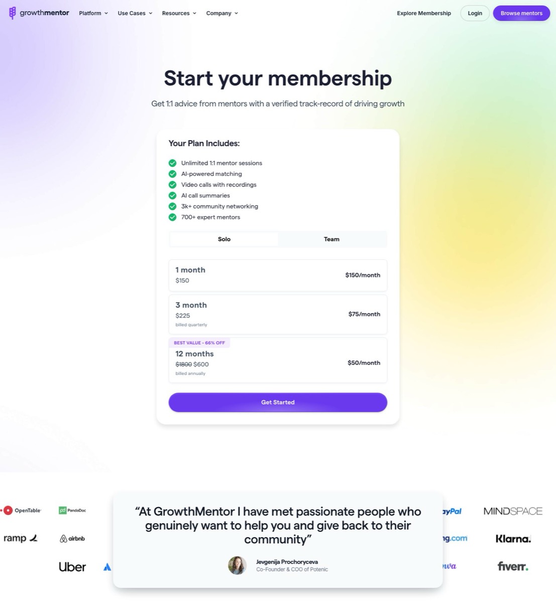
Check out GrowthMentor’s pricing page, for example.
Pricing is followed up by extremely adequate social proof, motivating copy, a member testimonial, and a wall of recognizable customer logos. Boom.
So…
If one of your themes is that pricing is too high and your pricing page doesn’t have any social proof or reinforcement of your value, try adding some in an experiment. Test it out. See if it helps performance. In theory, you should get more signups. Down the road, you could always complete more qualitative research to see if the theme still pops up.
Here’s an eCommerce example:
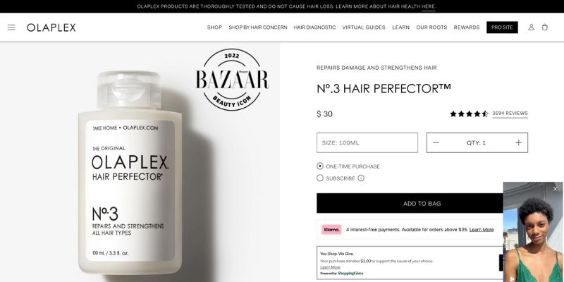
Social proof and benefits:
- Star review
- # of star reviews
- Bazaar award
- Social video
- Banner with info
Now, repeat this cycle over and over!
data → test → data → test
The loop that turns research into a flywheel. Each cycle sharpens themes, validates moves, and builds a record of what your customers actually responded to.
Chirpy methodology
Suggested mentors
Research and experimentation go faster with someone who does it daily. These three, including Haley who wrote this method, had time on their calendars this week:

Haley Carpenter
Founder of Chirpy and the researcher behind this method. CRO, experimentation, and turning feedback into tests.

Tracy Laranjo 🍊
Fractional Head of CRO and Experimentation. Helps teams build research-backed testing programs.

Stuart Brameld
Growth leader working across marketing and code, with a heavy experimentation bias.
Actionable takeaways
Now that you’ve read this, I’m begging you to please go do the following to help your digital performance:
- Gather qualitative data through any methodology that allows you to do so (e.g., poll, survey, interview, user test, etc.)
- Analyze it through the coding process used here (at least one round, if not two)
- Turn your insights into test ideas
- Repeat through doing more research and tests (using the same and other research methodologies)
Important notes: Know that the more data points to back something up, the better. Pair your qualitative data with your quantitative data.
Happy researching and testing!
Frequently asked questions




Mentors who run research and experiments for a living
You've got the method.
Now put it to work on your data.
Bring your survey responses, your test backlog, or just a hunch. A research or CRO mentor helps you turn the words into your next experiment.
Talk to a mentorKeep reading
More from the GrowthMentor blog
Growth Strategy · Apr 26, 2020
Your First 90 Days as a Growth Marketer: What You Need to Know
Daniel Johnson
Mentorship · Feb 07, 2024
How to Find a Mentor For Your Startup (Message Templates Included)
Micah McGuire
Mentorship · May 03, 2020
How to Be a Good Mentee (What the Best Ones Do)
Foti Panagiotakopoulos