The Anatomy of a Perfect Landing Page: How to Design for Maximum Conversions
First impressions matter more than ever before. Whether you’re launching a new product, promoting a service, or aiming to capture emails for your subscription list, one key asset can make all the difference: a well-designed landing page.
Imagine your website as a bustling airport. Amidst the hustle and bustle, only one carefully prepared runway can guide each flight to a successful touchdown. This is the critical role your landing page plays – it’s the runway that safely guides inbound traffic toward a successful touchdown, which, in our case, is the coveted conversion: a purchase, a subscription, an inquiry, or any action that drives your business forward.
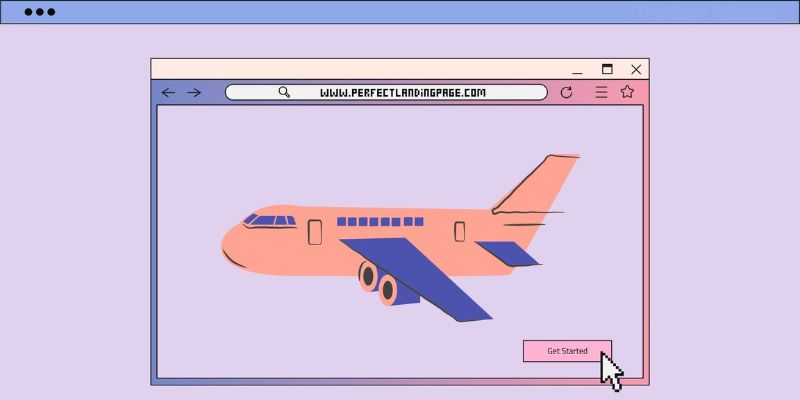
Now, think about an airplane approaching the runway. The pilot and crew have prepared meticulously for this moment, but the success of the landing ultimately depends on the conditions of the runway itself. Is it clear of obstacles? Are the guiding lights functioning effectively? Is it optimized for a smooth landing? Just like an airport runway, your landing page must be well-prepared and optimized to ensure your visitors — the passengers on our metaphorical plane — reach their desired destination smoothly and effortlessly.
So, what does it take to prepare your ‘runway’ for a perfect landing? What are the essential components that will ensure your visitors don’t just land, but disembark, excited and ready to take action?
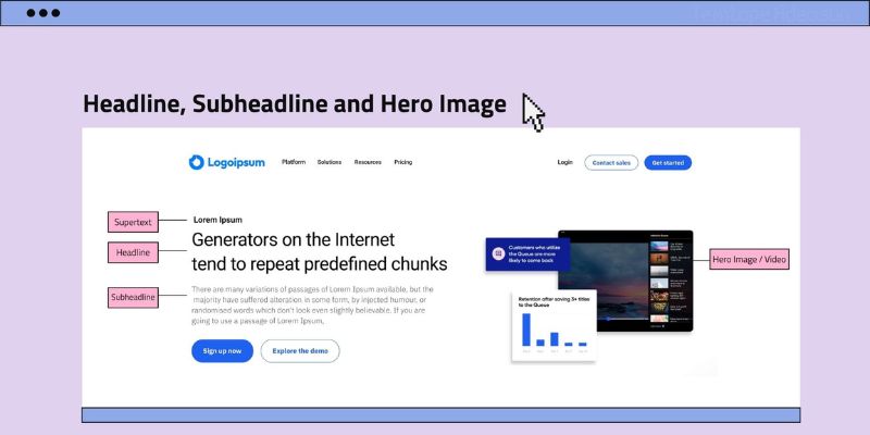
Headline and subheadline
Just like the initial glimpse of the runway gives the pilot crucial information about what to expect, the headline and subheadline of your landing page offer the first impression to your visitors. It sets the stage and conveys what your product or service is all about. Therefore, it’s critical that these be clear, concise, and captivating.
Remember, your headline and subheadline must serve two primary goals: firstly, to instantly communicate the unique value proposition of your offering; and secondly, to engage your visitors and make them want to stay and learn more.
Why does this matter? As David Ogilvy, known as the father of advertising, once said, “On average, five times as many people read the headline as read the body copy.” A compelling headline and subheadline can significantly increase the number of people who will read your entire page and, ultimately, take the desired action.
Hero image or video: Visualising the journey
When a plane approaches the runway, pilots rely not only on their instruments but also on their visual understanding of the terrain. Similarly, the visuals on your landing page can play a vital role in guiding your visitors towards conversion.
A picture, as they say, is worth a thousand words. Relevant, high-quality visuals, be they images, infographics, or videos, can not only break up large chunks of text but also convey complex concepts efficiently and engagingly.
Why is this important?
People are visual creatures. Studies show that visuals are processed 60,000 times faster than text by the human brain. By incorporating effective visuals, you can create an immediate, emotional connection with your visitors and communicate your value proposition quickly and compellingly.
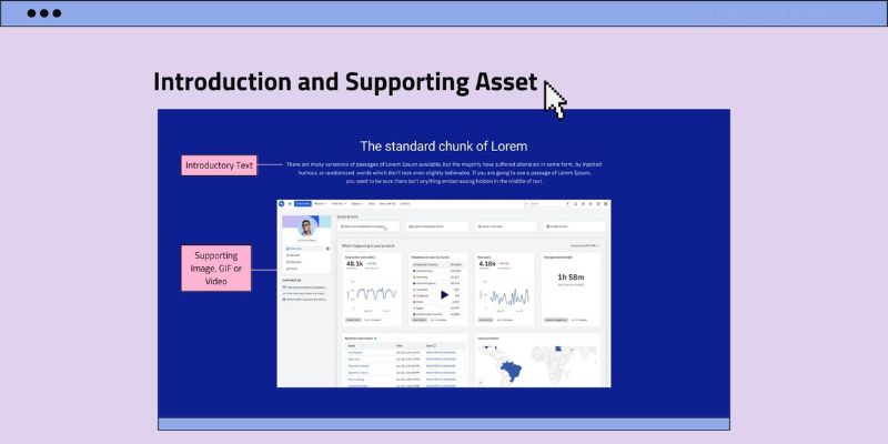
Introduction: Preparing for a touchdown
As we near touchdown, an introduction or explanation of your product or service offers the necessary runway lights. It’s a brief summary positioned just below the hero image or video, giving your visitors the basics about what you’re offering. This introduction should be engaging, informative, and lead smoothly into the details of your product or service.
The goal of the introduction is to quickly and effectively communicate what you’re offering, why it matters, and why visitors should care. It should make them want to explore further; and set the tone for the rest of the landing page as it impacts whether visitors stay engaged or bounce.
Craft an effective introduction:
- Your introduction should start strong and grab attention from the first words. This could be a thought-provoking question, a bold statement, or a relatable scenario.
- Be clear and concise clearly stating what your product or service is and what problem it solves or what value it provides. Use straightforward language that’s easy to understand.
- Focus on the benefits your users will get. How will it make their lives better, easier, or more enjoyable?
- Create an emotional connection by appealing to your visitors’ emotions by addressing pain points they might be experiencing or by showing how your solution fulfills a desire they have.
- When you can, use visuals like a compelling image or a short video to amplify the impact of your introduction, visually demonstrating what you’re talking about and engaging your audience on multiple levels.
- Ensure that you make a strong first impression, hook your visitors, and encourage them to explore further down the landing page runway.
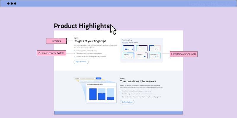
Product highlights: The runway markings
In the context of our airport analogy, the product highlights are similar to the specifications of an airplane that airline companies advertise. Does the plane offer more legroom? Are there in-flight entertainment systems? What’s the luggage allowance? These are features that attract passengers to choose one airline over another. This section should list the main features and benefits, organized in an easy-to-read format, and if possible, accompanied by relevant visuals.
The Product Highlights section of your landing page showcases the perks, the outstanding aspects, and the ‘wow’ factors of your product or service. It’s the place where you get to show off what makes your product or service shine and stand out from the rest.
These communicate the unique value of your product or service to the visitor. They are the tangible points that differentiate your offering from competitors and give your visitors reasons to choose you.
In presenting your highlights,
- Speak in the customer’s language without using any jargon or technical language that your customers may not understand.
- Focus on the unique features and exclusive benefits that set your product or service apart from competitors.
- Show, don’t just tell: Consider using visuals or videos to demonstrate your product or service in action, showing how the features work and the benefits they offer.
- Use clear and concise statements as your highlights need to be easy to read and understand quickly and bullet points could be a great way to achieve this.
- Lead with benefits that hook your audience, then back them up with features.
Remember, the goal of this section is not just to list out features, but to show how these features translate into real value for the user. It reassures them they’re making a good choice and guides them smoothly towards your desired action.
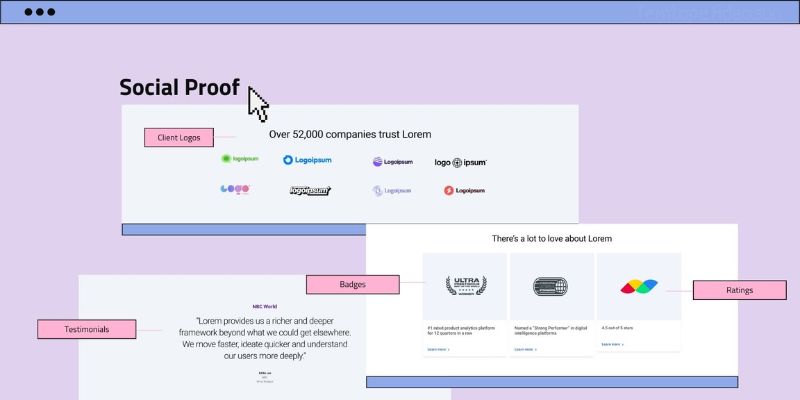
Social proof/validation: Airline reviews
The Social Proof section corresponds to the reviews an airline receives from its passengers. Just as travelers are highly influenced by reviews from past passengers when choosing an airline, your potential customers want to know about the experiences of others who have used your product or service before they commit to action.
This section of your landing page is where you can display testimonials, reviews, case studies, or a list of well-known clients. It serves as a platform for your satisfied customers to advocate for you, providing powerful and persuasive validation of your product or service.
Why is social proof important?
As humans, we are inherently social creatures. We often look to the actions and opinions of others to guide our behavior, a phenomenon known as social proof. In the context of a landing page, social proof helps build trust and credibility with your visitors. It reassures them that others have taken the leap and found value in your product or service.
Types of social proof
- Testimonials: These are positive statements made by your customers about their experiences with your product or service. They should be genuine, relatable, and specific about what they like. It’s a good idea to include the customer’s name and photo, if possible, to add credibility.
- Customer Ratings: Similar to testimonials, these provide feedback from previous users. You could display them in a star-rating system or use extracts from longer reviews. If you have a high average rating, be sure to highlight this.
- Case Studies: These are more in-depth than testimonials or ratings, detailing how your product or service solved a problem or provided a benefit for a customer. Case studies should be narrative, relatable, and backed by data wherever possible.
- Client Logos: If your product or service is used by well-known companies or organizations, displaying their logos can be a strong form of social proof. This is particularly effective in the B2B sector.
- Endorsements: If an industry expert or celebrity endorses your product or service, featuring this on your landing page can significantly boost your credibility.
User-Generated Content (UGC): This is content created by your users, such as social media posts or videos, discussing or showing off your product or service. It’s a very organic form of social proof. - Media Mentions: If your product or service has been featured in the media, be sure to include this. Whether it’s a quote from a positive review or the logo of a publication that’s covered you, media mentions can greatly enhance your reputation.
- Trust Badges: Security and trust are vital considerations for visitors before they engage with a website, product or even perform any transaction. These badges are symbols that verify the credibility and trustworthiness of your product. These play a crucial role in reducing online purchase anxieties, making users feel more comfortable about providing personal information and completing transactions on your site while boosting your credibility, and brand’s image, and can significantly improve conversion rates. Examples are Security Badges, Certification Badges, Award Badges etc.
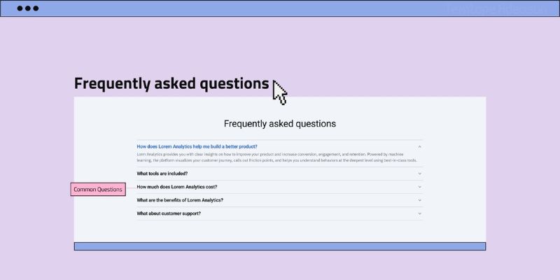
FAQs: Information kiosk
Providing quick answers to common questions a user might have before taking an action can be a huge determinant for a user who converts or bounces. We want to make sure you have all the information you need to make informed decisions and feel confident about your choices.
It is also a better option to answer key presale questions and concerns right from the start rather than gathering unqualified leads from your landing page so it is better to clarify and set the right expectations for your users before they submit their details and you now have to deal with soda when you have been waiting for wine.
How to create an FAQ section
The FAQ section is a powerful tool for overcoming objections and hesitations that might be holding your visitors back from taking action. It’s a way to provide transparency, alleviate doubts, and build trust. Visitors who find answers to their questions are more likely to proceed with confidence, knowing that you’ve considered their needs.
Identify common questions: Think about the questions that potential customers often ask about your product or service. What are the doubts or uncertainties that might prevent them from converting? These are the questions you want to address in your FAQ.
Provide clear and concise answers: Each answer should be concise yet helpful. Avoid jargon and use simple language that anyone can understand. If an answer is too long, consider breaking it into bullet points or subheadings.
Be honest and transparent: If there are limitations or potential downsides to your product or service, it’s better to address them openly in the FAQ. This shows that you’re trustworthy and not trying to hide anything.
Making the journey of your users through your landing page smoother by addressing potential questions and concerns upfront, will save you a lot of stress and customer support resources.
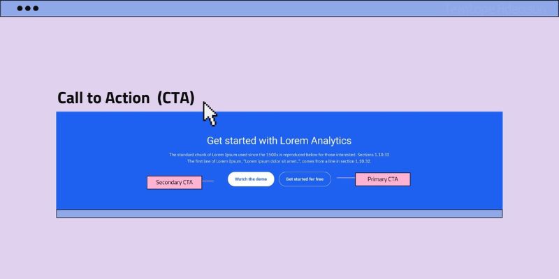
Call to action (CTA)
Now that your ‘passengers’ understand where they’re landing, it’s time to guide them to their intended destination which is also the action you most want visitors to take. Here, your interests align and it’s best to make it clear, prominent, and attention-grabbing enough to ensure your users do not miss it.
The CTA is arguably the most critical part of your landing page. The design, color, placement, and copy of your CTA can significantly impact its effectiveness. It should stand out visually on the page with actionable copy compelling enough to drive your visitors to take the desired action.
Why is this crucial?
Without a clear and compelling CTA, your visitors may be unsure of what to do next, resulting in lost conversion opportunities. Your CTA is the culmination of your landing page’s journey, leading your visitors from initial interest to conversion.
Secondary CTA: Two doors are better than one
Sometimes, visitors aren’t ready to take the main desired action right away. A secondary CTA is like an alternate exit, providing another, usually lower-commitment action that visitors can take if they’re not ready to convert just yet.
This could be a less committed action; an alternative for those who want more information before making a commitment, such as “Learn More,” “Explore,” or “Contact Us.”
How to craft CTAs
CAS: Clear, Actionable, and Scarcity are three keys that should not be missed when crafting a CTA. It is very important to make sure the text of your CTA is crystal clear enough that visitors should know exactly what will happen when they click it. It should use action-oriented verbs that encourage immediate action like Get, Start, Discover, etc. If applicable, add a sense of urgency or scarcity to your CTA, for instance, a “limited-time offer” can encourage quicker action.
Contrasting color: The CTA button should stand out from the rest of the page. Using a contrasting color that aligns with your brand can help draw attention.
Placement: Position your CTA where it’s easily accessible. It’s common to have it above the fold (visible without scrolling) and also at the end of the page. If you can, making your CTA float and sticky can be a good option for some offer pages.
Using forms strategically with CTAs
When your primary CTA prompts visitors to take action, a form can be seamlessly integrated to collect the information needed to fulfill that action. Whether it’s signing up for a service, receiving a download, or making a purchase, a well-designed form can make the process smooth and user-friendly.
Forms provide you with valuable data for follow-up, while also allowing visitors to engage more deeply with your offering. A well-crafted form can be the tipping point that turns a visitor into a lead or a customer.
How to create high-impact forms
Keep It Simple and Short (KISS): Only ask for the essential information you need. The more fields you include, the higher the chance visitors will abandon the form.
Progressive Profiling: If you need more information from returning visitors, use progressive profiling. This means gathering different details over multiple interactions, rather than asking for everything upfront.
Confirmation Message: After submitting the form, display a confirmation message or redirect users to a thank-you page. This confirms their action and provides the next steps.
By thoughtfully integrating forms within your CTAs, you’re not only guiding visitors toward their desired destination but also collecting the “tickets” – the data – that will help you nurture these leads and provide them with the best experience possible.
Conclusion: Navigating the skies successful
Just as a skilled pilot navigates an aircraft through the skies to ensure a safe and smooth landing, crafting a perfect landing page requires careful strategy and meticulous attention to detail. Your landing page serves as the runway where visitors touch down and take the desired action, be it making a purchase, signing up, or exploring further.
Remember, a landing page is more than just a collection of elements; it’s a harmonious blend of the right mixes based on the occasion by you, the mixologist. A culmination of design, psychology, and strategy, working together to create an environment where visitors can comfortably land and take flight towards becoming valued customers.
As you craft your landing page, envision each element as a piece of the puzzle, each contributing to the holistic experience you’re building. With a well-designed landing page, you’re not only welcoming visitors but also setting them on a journey that could transform them into loyal patrons.
So, prepare your runway, ensure your passengers have a clear path, and create a landing page that invites them to explore, engage, and convert. Just like a successful landing, it’s all about making the journey memorable and the destination fulfilling.